Of Lifetimes and Linewidths
Today Quanta published an explainer I wrote on the subject of resonance. Regular readers of this irregularly maintained blog will know that resonance is among my favorite topics in physics: from axion dark matter detectors to macroscopic quantum physics to the effects of tardigrades on superconducting qubits, my posts keep touching on resonance one way or another.
Resonance, in its simplest form, is the enhanced response of a system to a force that oscillates at one of the system’s “natural” frequencies. It explains why you can get a swing moving without much effort by timing your pushes appropriately and why a trained singer can shatter a wine glass with a sustained note at the right pitch.
[Update: I’ve written a short twitter thread with links to dramatic illustrations of resonance in other contexts, from the tides to the design of skyscrapers to gravitational wave detectors. Check it out!]
I devoted a fair amount of space in my explainer to the resonance curve that describes how a system responds to an oscillating force as a function of the frequency at which that force oscillates. As it so happens, this resonance curve is also my site icon:1A technical detail: this is actually a plot of the exact frequency response of a harmonic oscillator. What I’ve called the “universal resonance curve” is the peak around the resonant frequency, which has a Lorentzian (or Breit-Wigner) lineshape.
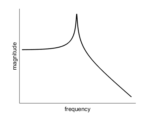
One of the many interesting things about this curve is that it is completely characterized by just two numbers: the frequency at which resonance occurs, and the width of the peak, known as the linewidth.2It may seem like there’s a third number here: how tall the peak is relative to the flat part at low frequency. But the peak height is actually completely determined by the linewidth; it’s not an independent parameter. In a single sentence in my explainer I noted that the linewidth “reflects how lossy the system is, indicating, for instance, how long a glass rings after it is struck once.”
This relationship between the lifetime of an excitation in a resonator and the linewidth of the corresponding resonance curve is the subject of this blog post, in which the only math will be of the “look at these waves and draw some conclusions” variety. The lifetime/linewidth relationship may seem like a boring technical detail, but it reveals a deep connection between time and frequency characteristic of all waves, from light to acoustics to the wavefunctions of quantum mechanics.
Why care about linewidths?
Before diving into waves, I’ll say a few words about particle physics to convince you that resonance linewidths are interesting — if you’re already on board and want to get to those sweet sweet waves you can skip ahead to the next section.
The aim of my explainer was to connect everyday examples of resonance to its manifestations in particle physics. This is why I chose to devote so much attention to the resonance curve, which is one of the few tools available to experimental physicists who use large colliders to study the properties of particles. Here’s a nice example of data from electron/positron collisions:
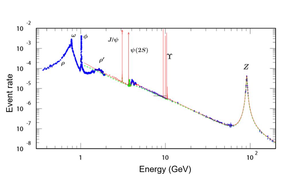
The meaning of the vertical axis isn’t important for our purposes: just glancing at the right side of the plot reveals that some measurable quantity is much larger when electrons and positrons collide with an energy close to 90 GeV than when they collide with an energy close to 60 GeV.3GeV is the symbol for a unit of energy called a gigaelectronvolt. 1 GeV is very close to the rest mass energy of a proton. Both the x and y axis scales are logarithmic; the large tick mark labeled \(10^2\) indicates 100 GeV, and each small tick mark to the left represents a step down by 10 GeV. This enhancement around 90 GeV — an energy related to the mass of the \(Z\) boson by \(E = mc^2\) — is a beautifully clear example of a resonance curve.4Here the resonance curve appears as a function of energy, rather than a function of frequency. This is because of a deep relationship between energy and frequency in quantum mechanics that I touch on briefly in my explainer, and also in this wide-ranging blog post.
But it’s not just the \(Z\) boson: each peak here, from the crappy-looking \(\rho’\) meson bump to the extremely narrow \(J/\psi\) meson spike, is a resonance associated with a different particle! Evidently the resonances that appear in particle physics have a very wide range of linewidths.5You may rightly complain that these resonances don’t all have the same lineshape. This is because we’re seeing the (universal) resonance curves superimposed on a bunch of other energy-dependent contributions to the scattering rate, which will make broad peaks especially lumpy. For example, the \(\omega\) and \(\rho\) meson resonances overlap, distorting both peaks. These linewidths tell us about the lifetimes of unstable particles, with wider peaks indicating shorter lifetimes.
The \(J/\psi\) resonance played a very important role in the history of particle physics. When it was first observed in 1974, its most striking feature was an extremely narrow linewidth, which signaled the existence of a new kind of quark: any particle made of the three quarks known at the time would break apart into lighter particles very quickly. The flurry of experimental and theoretical activity triggered by this discovery ushered in the Standard Model of particle physics, which has remained largely unchanged for the past half-century.
The point of all this is that the linewidth/lifetime relationship is important and it’s worth understanding where it comes from. The relationship is often said to be a consequence of the “time-energy uncertainty principle.” That isn’t wrong per se, but I find it very unhelpful because it makes the relevant physics sound a good deal more mysterious than it really is. We can make sense of it with an example that’s much closer to home.
The universe in an empty glass
Richard Feynman once attributed to an unnamed poet the assertion that “the whole universe is in a glass of wine.” But to study resonance — a universal phenomenon if there ever was one — we can dispense with the wine and just look at the glass itself.
The wine glass has recently become my favorite conceptual tool for exploring the physics of resonance. It’s easy to imagine how you would measure its resonant frequency: just flick it once with your finger and record to the sound it emits.6The perceived pitch of a musical note corresponds to the frequency of the underlying sound wave. It’s also easy to conceive an experiment to measure the resonance curve: just keep sending sound waves at the glass while gradually dialing up the wave frequency, and measure the sound volume.7For the experts: the scattering thought experiment described here hinges on the fact that the energy decay of a wine glass is usually dominated by external loss. This isn’t true of most mundane examples of resonant systems, and it’s another reason I like the wine glass so much. In my explainer I described a version of this gedankenexperiment8This is the German word for “thought experiment,” widely used in physics because (as in the case of schadenfreude) the Germans were the first to give it a name. using the human voice.
Suppose we tune an incident sound wave to exactly the resonant frequency of the wine glass and compare the resonance curve amplitude to the amplitude when the frequency is detuned very slightly. There’s no appreciable difference, indicating that the wine glass doesn’t distinguish these two frequencies. Now detune the wave a little further and there’s a very large difference in amplitude, even though the the frequency is still quite close to resonance (assuming the resonance curve is very sharp). We want to understand why the resonance curve has a particular linewidth, or equivalently why the wine glass distinguishes the two frequencies in one case but not the other.
To find the answer, let’s step away from the wine glass momentarily and ask the following question: under what circumstances can we distinguish the frequencies of two waves?
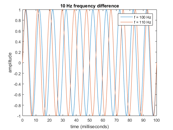
The plot above shows two sine waves with frequencies \(f_1 = 100~\text{Hz}\) and \(f_2 = 110~\text{Hz}\) — that is, they undergo 100 and 110 oscillation cycles every second, respectively.9In the wine glass example, they represent sound waves, which are oscillations in air pressure: a positive number represents compression relative to the ambient pressure, while a negative number represents rarefication (a cool word that I don’t get to use often). The hertz (Hz) is a frequency unit: 1 Hz = 1 cycle per second. The horizontal axis shows what happens in the first 100 milliseconds when the waves start in sync: during this time wave #1 completes 10 oscillation cycles while wave #2 completes 11 cycles. We see that at very early times it’s difficult to distinguish the waves, but they become more and more distinguishable as time goes on. After 50 milliseconds, they’re exactly out of phase: a peak in wave #1 lines up with a trough in wave #2. After this they start to come together, overlapping again after 100 milliseconds.10Then the cycle repeats: out of phase at 150 milliseconds, in phase at 200 milliseconds, etc. In other words, the phase difference between the two waves itself oscillates like a wave at a frequency called the beat frequency, which is equal to the difference between the two wave frequencies: 10 Hz in this case.
Here’s an analogy that encapsulates all the same mathematics: suppose two runners start racing around a circular track. One runs 10% faster than the other, but at the beginning of the race, it’s hard to observe this difference from a distance. As the race goes on, runner #2 pulls ahead, and after runner #1 has completed 5 laps, runner #2 has completed 5.5 laps — she’s exactly on the opposite side of the track. If they keep going for the same amount of time, runner #2 will pull up close to #1 again, having completed a full extra lap.
In the plot above, after 50 milliseconds, the waves are maximally distinguishable. Generalizing from these specific numbers, the time \(\delta T\) after which two waves with frequency difference \(\delta f = f_2 – f_1\) become maximally distinguishable is given by the simple equation \(\delta T = 1/(2\delta f)\).
So when are the two waves not distinguishable? They gradually grow more distinguishable as time goes on, so there’s no unique answer to this question. Instead I’ll simply assert that two waves are indistinguishable when their frequency difference is
\[ \delta f \ll 1/(2\delta T),\]
where \(\ll\) means “much less than.” You can define “much” here however you like; the point is that the smaller the frequency difference, the longer we must wait to distinguish the two waves. To drive this point home, here’s a plot of the same time interval when \(f_2 = 101~\text{Hz}\):
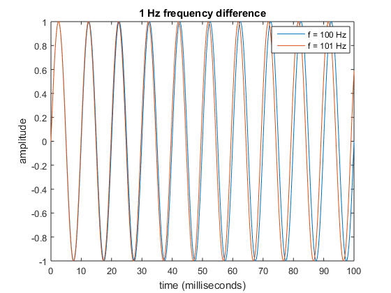
50 milliseconds is now not enough time to tell the two waves apart. But as a matter of principle, any frequency difference is resolvable if we’re willing to wait long enough.
Finally, we turn back to our friend the wine glass. Let’s imagine we’re recording the sound emitted by the glass after giving it a sharp tap, and we’d like to determine whether its frequency is 100 hertz or 101 hertz. The trouble is that we only have so much time to make our measurement: the energy in the sound wave decays exponentially11“Exponential” here refers to the specific mathematical form of the decay; it doesn’t mean “very fast,” as it unfortunately often does in popular usage. An exponential decay always happens over some characteristic timescale, which can be very long: for example, the radioactive decay of uranium-238 happens on a timescale of billions of years. with characteristic lifetime \(\tau\).12This lifetime \(\tau\) is one way to quantify the exponential decay timescale; another is the half-life. \(\tau\) is defined as the time it takes for the energy to drop by a factor of \(1/e\approx0.37\), where \(e\) is Euler’s number. This may sound like a weird definition, but it allows us to express the decay in the convenient mathematical form \(e^{-t/\tau}\). For this example I’ll take \(\tau = 33~\text{ms}\).13None of the numbers I’ve used here are appropriate for an actual ringing wine glass. I’d generally expect a wine glass to resonate at about a kilohertz and ring for a few seconds. This means its lifetime would correspond to roughly a thousand oscillation cycles, rather than a pathetic tenish cycles with the numbers I’ve chosen. But these more accurate numbers would be less convenient to plot. Here’s what the two decaying sine waves look like:
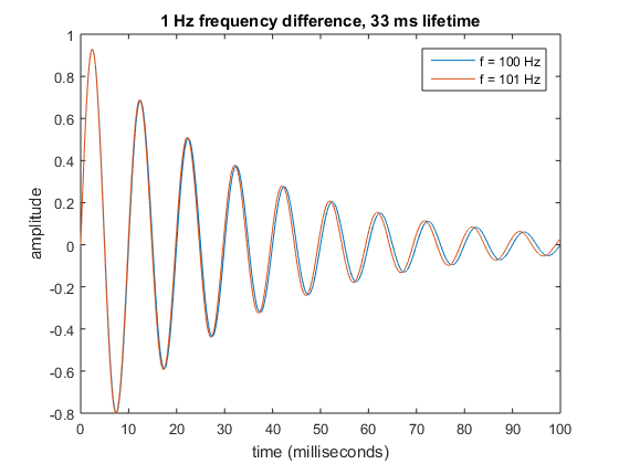
By the time the two waves have dephased appreciably, their amplitudes are already very small. So in the presence of energy loss, we can never make the two waves maximally distinguishable.14You may ask: why must the sound fade? That’s a very poetic question to which I could attempt a poetic answer. But at a more prosaic level, it fades precisely because you can hear it! There’s some initial energy in the vibrations of the glass, and the sound waves that the glass emits carry that energy away. In particular, we’re out of luck if the frequency difference \(\delta f\) that we’d like to measure is very small compared to a characteristic frequency scale \(\Delta f\) defined as
\[ \Delta f = 1/\tau.\]
Now I’ll make a slight conceptual leap, which can be justified mathematically; my hope is that it makes some intuitive sense after the discussion thus far. “What’s the exact frequency of the sound emitted by the wine glass” is not even a meaningful question: that sound is a mixture of sine waves with different frequencies that fall within a frequency interval \(\Delta f \) centered on the resonant frequency of the glass. And if the wine glass can’t distinguish two closely spaced frequencies when it comes to the waves it emits, how can it distinguish two incoming waves with frequency difference much smaller than \(\Delta f\)? Here, finally, is the linewidth/lifetime relation we’ve been looking for: the above equation for \(\Delta f\) is in fact the definition of the resonance curve linewidth.15This equation looks similar to the ones above, but the change of notation is meaningful: we can choose whatever values we want for \(\delta T\) and \(\delta f\), while \(\tau\) and \(\Delta f\) represent fixed properties of a specific resonance.
Waves, waves, everywhere…
Let’s recap what we’ve learned. Suppose we want a resonator to ring for a very long time before its vibrations die down. The resonance curve will necessarily be very narrow. If, on the other hand, we want our resonator to respond to a broad range of frequencies, its lifetime will be short. We can’t have it both ways. This tradeoff is one instance of a very general relation between time and frequency intervals in Fourier analysis, the branch of mathematics that describes the behavior of waves. Hugh Lippincott, now a physics professor at UCSB, wrote a great series of blog posts as a grad student about Fourier analysis that assumes no math background.
Now for some quantum mechanics. Multiplying both sides by \(\delta T\) and being slightly cavalier with numbers, we can rewrite our criterion for wave distinguishability in the form
\[\delta f\,\delta T > 1/4\pi,\]
which looks an awful lot like the famous uncertainty principle
\[\delta x\,\delta p > h/4\pi,\]
where \(\delta x\) and \(\delta p\) represent uncertainty in a particle’s position and momentum, respectively, and \(h\) is a fundamental constant of nature called Planck’s constant.16In these equations I’ve snuck in extra factors of \(2\pi\), which come out of the mathematics of Fourier transforms. This is not coincidental: the uncertainty principle is a direct consequence of Fourier analysis that is exactly analogous to our relationship between a resonator’s lifetime and its linewidth. There are lots of mathematically similar uncertainty relations in quantum mechanics. As I mentioned near the beginning of this post, the one that is often invoked to explain the lifetime linewidth relationship in particle physics is the “time-energy uncertainty relation”
\[\delta E\,\delta T > h/4\pi.\]
But this is just our time/frequency relation, with frequency replaced by energy! In other words, the only mysterious thing going on here is the quantum relation between energy and frequency. The rest is a simple consequence of the mathematics of waves.17This is by no means true of all the unusual properties of quantum mechanics.
Fourier analysis is a shining example of a simple framework that is applicable to a wide range of different problems within and beyond physics. And resonance has proved to be a powerful conceptual tool for getting an intuitive grasp of the relation between time and frequency intervals at the heart of Fourier analysis. Along the way you got a free gedanken glass of wine after learning that all you needed to understand resonance was the glass itself. Did you really think I was going to end this post without a drop to drink?
No worries. Thanks for the feedback. This confirms that I will have to find ways to present the ideas in a less mathematical way (as my comment above tried to do) as well as to push forward the mathematical development. I should say that I’m pretty sure any appearance of my paper having a high mathematical level is more novelty than sophistication.
One of my hopes is that if we can construct interacting QFTs without the intricacies of renormalization being necessary then the whole topic will become more accessible as the ideas filter out. If the perspective you take above and in your Quanta article can be expanded to include multiple resonances —either as a continuum or as a small finite number of resonances, in the latter case perhaps or perhaps not as an approximation to the former— it seems plausible to think that suitable engineering of variously focused resonances would or might create analogs of optical caustics. I have to admit that what I say is a proof that that can work as well as ordinary interacting QFTs is only a proof sketch, but such things are never built in a day.
Translating the more mathematical parts of theoretical physics into language is always hard — over my research career I found that getting people on the same page and speaking the same language was often half the battle, even with much simpler subjects.
I’m feeling some resonance with this. I commented on Quanta, but they may filter it for being self-promoting, so I’ll repeat it here. Answer it here, there, or not at all, or delete it, as you like.
“If we think of any system as resonating in multiple ways, as if it has different fragments that resonate with fragments of other systems in multiple ways, we can construct an alternative approach to interacting QFT. Instead of integrating over all paths, we can approximate any such integration by summing over enough different resonances, in a mathematically well-defined way. https://arxiv.org/abs/2109.04412, “A source fragmentation approach to interacting quantum field theory” explores the mathematics, beginning with a proof that this is a viable way to replace the renormalization approach.”
Given your announced fascination with resonance, if I may call it that, I hope it’s worth a few minutes to think about what I think is a new way to think about it. In any case, I’ll leave now, and rise the morrow morn.
Thanks for posting! I must confess that, while I used to know some QFT as a grad student, that knowledge has seriously atrophied over the past four years hunched over cryostats, etc. So much of the math goes over my naive experimentalist head. But I’ve saved the paper to come back to at a later date. I hope to explore the nooks and crannies of resonance for many years to come!